Talking turkey about test scores
Avoiding the narrative fallacy when interpreting student data
Charles Darr
This Assessment News article examines the role of measurement error in standardised tests and what it means for progress measures. Charles Darr explains that standardised test scores and the progress trajectories we infer from them do not necessarily reflect a student’s true achievement level. Measurement error is the normal day-to-day variation in test performance from factors such as fatigue, anxiety, interruptions, or guessing, and it can make apparent trends (rises, dips, widening gaps) look meaningful when they are not. Teachers are shown what to look for to interpret both single scores and progress measures more accurately.
Too much certainty can be deadly
In his book, The Black Swan (2010), Nassim Nicholas Taleb tells the tale of a well-fed turkey that grows more certain each day that its future looks bright. Every uneventful morning confirms its belief that the world is safe and the farmer benevolent. The data look consistent and sensible—until the day of the traditional American Thanksgiving celebration, when the pattern completely shatters.
Taleb calls generating a coherent but ultimately flawed story to explain a series of observations the “narrative fallacy”. According to Taleb, producing narratives that stitch sparse facts into tidy explanations ignores what we don’t know and underestimates the randomness that is a big part of the world we live in. Unfortunately, we often feel an urge to craft such stories, and many people struggle to resist a compelling narrative.
Avoiding the narrative fallacy is critical when considering assessment data, especially the scores generated by standardised tests.
Look at the graph shown in Figure 1. It contrasts the score trajectories generated using a PAT Pāngarau | Mathematics test for two fictitious students (Student A and Student B) over a period of 5 years. Based on the data, what can we say about the learning journeys for each student?
A quick look suggests that, for the first 2 years, both students achieved at a similar level. However, over the last 3 years, Student A seems to have struggled to “keep up” with Student B, with the gap between their scores increasing.
What could have caused this divergence?
It is easy to shift from noticing score differences to explaining how they might have occurred. Perhaps Student A has lost some motivation in more recent years? Or could it be that Student B has benefited from a more capable teacher or an innovative programme?
These kinds of explanations do seem plausible. However, in this case they would be wrong. What the graph is showing are two sets of results for two students whose underlying “true achievement level” is the same.
In classical test theory, a true achievement level is the level a student would show if we could measure it perfectly (without random error) at that time. Any single test score is only an estimate of that level.1
The differences we are observing in Figure 1 at each time point simply reflect measurement error that can occur when a standardised test takes a snapshot of achievement.
How I generated the results
To generate these results, I chose five scores to represent the students’ identical “true” achievement level at each time point. I then simulated possible test-score trajectories by adding a random element to each score to represent the measurement error. The size of the measurement error was calibrated to the test’s reported standard error, so the simulations reflect typical test “wobble”. The two simulated trajectories in Figure 1 show how results can sometimes diverge quite sharply, even when they stem from the same underlying achievement.2
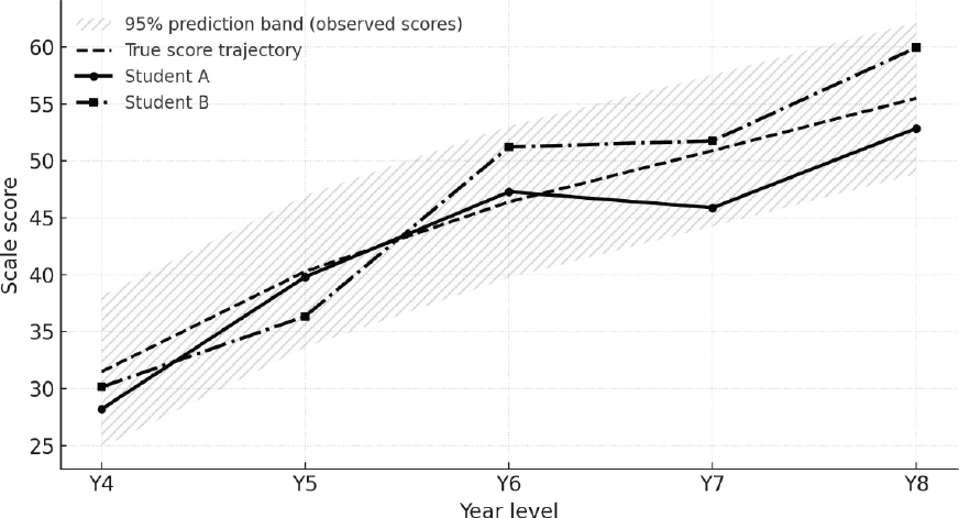
Figure 2 reveals the original “true score” trajectory using a dashed black line. The grey zone surrounding the black line indicates how far scores on the test might depart from this line at any given time point due to measurement error. As can be seen, the trajectories for students A and B are clearly within the grey zone.3
Together, Figures 1 and 2 show just how imprecise educational measurement can be. Unlike height or weight, test scores are more likely to be affected by factors that introduce measurement error and limit precision.
Measurement error is the normal day-to-day variation we expect in performance from things such as fatigue, anxiety, interruptions, or guessing. It also arises because each test samples only some questions from the wider achievement domain, which can randomly advantage some students over others.
Most standardised tests report a Standard Error of Measurement (SEM).4 The SEM represents a “plus-or-minus zone” around the reported score. As a rule of thumb, we can be relatively confident a student’s true score lies in that zone about two-thirds (about 68%) of the time. For example, if a test reports a scale score of 56 with an SEM of 3, the student’s true score is plausibly in the range 53 to 59. Test manuals often advise users not to treat two scores as different if their plus-or-minus ranges overlap.
Our eyes love the last few dots
When we read a graph, we don’t just “see” the data—we interpret it, often using mental shortcuts. A common shortcut is recency bias (sometimes called last-point anchoring): we give extra weight to the most recent dots and then build a story from there. Research on forecasting and graph reading shows people often stick too closely to the latest values and under-adjust for normal ups and downs—especially with line graphs that visually tie points together (Cho et al., 2017; Harvey & Reimers, 2013; Theocharis et al., 2019).
Why it matters: a small gap in the last few years can feel like a real split, even when it’s just noise.
Some schools use stanines rather than scale scores to report PAT results. Stanines divide the distribution of scores for a nationally representative year group into nine bands, from the lowest (stanine 1) to the highest (stanine 9). As such, each stanine covers a range of scale scores rather than a single point. However, it is still important to consider measurement error when interpreting stanines. A change of one stanine can easily result from normal test variation, while a shift of two or more stanines is more likely to indicate a genuine change in achievement.
What can we take away from this?
Test scores can help build narratives about students’ learning journeys. These narratives may guide important decisions and influence how people see themselves and others. They have little value, however, if they are based on score patterns that could reasonably be explained by measurement error.
Figure 1. Score trajectories on a standardised test for two students
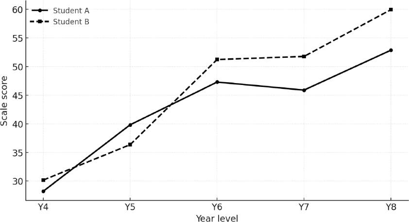
Figure 2. Score trajectories for Students A and B with the original “true score” trajectory
Avoiding the narrative fallacy starts with a realisation that test scores are inherently noisy. That is, they contain measurement error. As educators, we need to factor this into how we present and interpret test results. There are several practical steps teachers and school leaders can take.
First, use the SEM to report scores as zones (e.g., 53 ± 3 rather than just 53) and show those zones on graphs. Doing this reinforces that educational measures have limits and that a test locates achievement within a range, not as an exact point.
Second, combine test data with classroom observations and other evidence when commenting on progress or making instructional decisions. Anecdotes and samples of a student’s work provide important context for test scores.
Finally, when sharing with parents and whānau, emphasise that a single test result is only one piece of the achievement puzzle. A trajectory of results, accompanied by the commentary described above, provides a clearer picture of ongoing achievement.
Why is this important right now?
Understanding measurement error helps us counteract a powerful human bias: the tendency to seek tidy explanations for messy data. Recognising that uncertainty is normal, not exceptional, helps us make more balanced judgements about students’ learning.
The Ministry of Education has signalled that, from 2026, standardised assessments will be used twice yearly for students in Years 3–8, and that reporting frameworks will include sharing test-based information with parents and whānau. It is therefore vital that educators, students, parents, and whānau can interpret these scores accurately. Without an understanding of random measurement error, people may draw conclusions that are unwarranted, unhelpful, and potentially harmful to students’ progress and wellbeing. Acting on this understanding helps ensure none of us becomes Taleb’s unsuspecting turkey.
Notes
1.You can think of the true score as the average score a student would obtain across many equivalent versions of the test taken under identical conditions (with no learning or memory effects between attempts).
2.This example of divergence is relatively rare but not exceptional. In my simulations (assuming no real difference between students), a pattern where the same student is ahead in each of the last 3 years and the gap keeps getting bigger happened in about 5% of cases. There were other patterns, however, that could be just as eye-catching and would appear at a similar rate—for example, two students might start with a gap that appears to converge over subsequent years.
3The grey zone represents a 95% prediction band around the true-score trajectory. Under normal test conditions, an individual observed score at a given time point is expected to fall inside this band about 95% of the time.
4PAT Pāngarau | Mathematics reports an SEM for each scale score. This is typically around 3.4 scale score units.
References
Cho, I., Wesslen, R., Karduni, A., Santhanam, S., Shaikh, S., & Dou, W. (2017). The anchoring effect in decision-making with visual analytics. 2017 IEEE Conference on Visual Analytics Science and Technology (VAST) (pp. 116–126). IEEE. https://doi.org/10.1109/VAST.2017.8585665
Harvey, N., & Reimers, S. (2013). Trend damping: Under-adjustment, experimental artifact, or adaptation to features of the natural environment? Journal of Experimental Psychology: Learning, Memory, and Cognition, 39(2), 589–607. https://doi.org/10.1037/a0029179
Taleb, N. N. (2010). The black swan: The impact of the highly improbable (2nd ed.). Random House.
Theocharis, Z., Smith, L. A., & Harvey, N. (2019). The influence of graphical format on judgmental forecasting accuracy: Lines versus points. Futures & Foresight Science, 1(1), e7. https://doi.org/10.1002/ffo2.7
 Charles Darr is a kaihautū rangahau | chief researcher at Rangahau Mātauranga o Aotearoa | NZCER.
Email: charles.darr@nzcer.org.nz